
Eye-catching graphics combine conventional business informational text along with attention-grabbing artwork, compliments of Tiger Services, San Antonio, Texas.
The most attention-grabbing graphics can be just that and nothing more. Curious images or enticing text can interest viewers but are these graphical representations enough to get someone to take action or just evoke a brief outburst of laughter?
The NEWSwanted to know what HVACR contractors were doing to display their messages on service vans and how they felt about the power of graphics. In a recent online survey at www.achrnews.com, 219 respondents answered questions about two different service vans (Figures 1 and 2), how they displayed graphical messages, and the importance of vehicle graphics.
HVACR contractors have been trying different types of visual imagery to either provide a concise message about their products and services or arouse curiosity with graphics that provide little or no descriptive text. And then there are those who use plain white vans with no messages.
It is all about personal preferences and the markets these contractors serve.
“Graphics are certainly not the sole reason to do business with anybody but can make a top of mind difference in placing that company in the choices,” said Theo Etzel of Conditioned Air Corporation of Naples, Inc., Naples, Fla. “Clean graphics, easy to understand what they do, and neat presentation do give the impression of being more professional and organized. The proof is still in the execution of services provided and value received.”
Many of the respondents agree that graphics are important, but that service and reputation are the key reasons why customers choose to do business with them.
“Well-designed graphics indicate attention to detail and are able communicate a company’s capabilities to the customer,” said Frank Johnson of Robertson Morrison Inc., Ann Arbor, Mich. “However, an eye-catching graphic does not guarantee good service.”

FIGURE 1. Van No. 1 in the survey depicts a “Comfort Creature” and very little else on the back.
VAN NO. 1 OR VAN NO. 2?
The van in Figure 1 belongs to Peaden Air Conditioning, Panama City, Fla., a residential service and replacement contractor. The van in Figure 2 belongs to Monsen Engineering, Fairfield, N.J., a commercial/institutional contractor. Both have starkly different markets, which are represented in the graphics they use on their service vans, and both provide a contrasting use of visual graphics.Peaden uses its trademark “Comfort Creature” to attract attention and keep its top-of-mind awareness (TOMA) among the residents of the communities it serves. Monsen uses straight text to describe what it does and is purposely not designed to be eye-catching, only informative.
The first survey question was, “Based on the service van graphics above, which company do you think a customer would call - Company 1 or Company 2? Why?”
The results, in Figure 3, show that 66 percent of respondents feel that customers would call Company 2 (Monsen) while 34 percent would call Company 1 (Peaden). Here are some of the remarks from respondents.
“Van No. 2 has more information about the company, giving the customer a more comfortable feeling,” said Ron Stroh of D. Silvestri & Sons, Inc., Fishkill, N.Y. “Most important is the license number, which means the company has to be insured.”

FIGURE 2. Van No. 2 in the survey depicts standard text and company logo on the back.
“There is a phone number,” said Jaime DiDomenico of N&M Cool Today, Sarasota, Fla. “The red service line POPS and there is a Website. The first pictured van does not show what they do and without some heavy branding, will not be noticed.”
“I had graphics with characters before,” said Brian Furman of Brass Monkey A/C & Heating, Wimauma, Fla. “I switched to detailed graphics like the second van and my business increased. It seemed like people didn’t take me seriously when I used a character.”
Some respondents understood the logic behind both the designs.
“There is too much info on the second van,” said Laurie Goodrow of Junction Mechanical, Needham, Mass. “But the first van should have a Web address. I think the less is better says it all about these two trucks. I check out design on trucks as I’m driving and it annoys me so much if I can’t get a number or Website to visit or call.
“Personally I love graphics. I am a female and I find that men don’t seem to get caught up in color, style, or graphics as much as women.”
“I was first going to say maybe the first van would affect my decision to call because the customer would remember that the logo was different,” said Brad Forgrave of Elliott Heating, Cooling & Plumbing, Sault Ste. Marie, Mich. “But then I saw that there is no phone number or even a company name on the back of that van so how could the customer ever know to call them? They’d have to chase them down.”
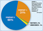
FIGURE 3. Based on the service van graphics above, which company do you think a customer would call - Company 1 or Company 2? (218 replies)
THE IMPORTANCE OF GRAPHICS AND THE COSTS
The survey asked respondents, Should eye-catching graphics make a difference when trying to attract new customers? Why or why not?The results, in Figure 4, show that 82 percent of respondents feel that graphics should not make a difference in attracting new customers, while 18 percent feel graphics should make a difference.
“Most people don’t sit and analyze eye-catching graphics,” said Paul Fredericks of Standard Oil, Bridgeport, Conn.
“You want them to know who you are at a glance. Keep it simple and make it grab attention. If I started my own company, I’d paint the vans bright pink with big block letters and numbers. They won’t even need to read the lettering though, they’ll know what company it is from a mile away.”
“A graphic message depends on the customer you’re trying to reach,” said Andy Rodenhiser of Rodenhiser Plumbing and Heating, Holliston, Mass. “It promotes market share and a brand awareness factor. I respond to graphical questions by asking:

FIGURE 4. Should eye-catching graphics make a difference when trying to attract new customers? (218 replies)
2.Does it speak to what I want?
3.Is the brand one that I trust and does it make me feel safe?”
While most respondents didn’t see graphics as a reason to attract new customers, when asked, Would you be willing to spend more money to have eye-catching graphics on your vehicles? - 77 percent said yes and 23 percent said no (Figure 5).
“We redesigned our logo recently and added a slogan to tell people what we do,” said Craig Jones of Slasor Heating & Cooling, Livonia, Mich. “We also minimized our affiliation with a manufacturer, and increased the size of our logo and increased the presence of our Website address.”
“Our graphics are the company name in 12-inch high diagonal lettering that spans the side of a 12-foot box truck in bright red with black shading,” said Bruce Solomon of Bruce Solomon Plumbing, Heating & Air, Reisterstown, Md. “It is the same logo that is on everything we do. I would add more graphics if it could enhance identification without confusing the customer in thinking it is a different company’s truck.”

FIGURE 5. Would you be willing to spend more money to have eye-catching graphics on your vehicles? (215 replies)
“We have changed our graphics recently to modernize our appearance. The graphics we are using are more photographic images than symbols and drawings. People recognize what we are trying to say about our company through pictures better than through catchy drawings.”
While most respondents said they would spend more money to have eye-catching graphics, in another odd twist to the survey, a majority of respondents said they would not change their graphics.
The question was: Given the choice of obtaining a new fleet of vehicles today, would you keep your graphics or change them? Why? A total of 69 percent said they would keep their graphics while 31 percent said they would change them (Figure 6).
“It’s not really fair to judge a company based on their creativity in logo design, but it’s what I see first,” said Michael Breen of Sure-Fire, Inc., Horicon, Wis. “Personally, it tells me how much effort the company puts into their business, image, and possibly their work.”

FIGURE 6. Given the choice of obtaining a new fleet of vehicles today, would you keep your graphics or change them? (214 replies)
“Our vehicles have two marketing goals. First, the truck identifies the company so our customers will feel an identity to and recognize us whenever they see the trucks around town. Second, we have recently started using a tailgate marketing campaign where we display specific sales messages, products, or consumer offers on the tailgate in a 48- by 16-inch frame. They are changed monthly and have been very successful.”
One contractor is happy to spend money on graphics because graphics have made his people “celebrities.”
“In our pool service division, the back of the van has a full graphic of a boy jumping in the pool with our name and phone number below,” said Art Grace of Krutsch Mechanical, Taylor, Mich. “We have had people pull us over to get a card and have called while driving behind the truck. It has been a great head-turner.”
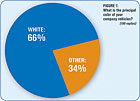
FIGURE 7. What is the principal color of your company vehicles? (199 replies)
VAN COLOR AND TYPE OF GRAPHICS
It is safe to assume, based on the survey results shown in Figures 7 and 8, that a majority of HVAC contractors prefer the conventional white van with a standard logo or text.A total of 66 percent of respondents said their vans were white, while 34 percent said they had a different color or blend of colors (Figure 7). A total of 57 percent of respondents said they used a standard logo with text, while 43 percent said they used eye-catching graphics (Figure 8). In many cases, the market dictates the type of graphics used or not used.
“Most nonindustrial customers won’t know what that engineering truck does [survey van in Figure 2],” said Sahin Ibrahim of Active Air Cooling & Heating, Inc., Bronx, N.Y.
“When they think a/c, they don’t think engineering.”
“I only want our company logo on our vehicles,” said Gary Jacob of Jacob Brothers Heating and Air Conditioning, Cincinnati.
“Sometimes less is more. I believe that too much information being displayed on our vans distracts the general public from remembering our company. We are the brand that I want the customer to identify with.”
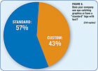
FIGURE 8. Does your company use eye-catching graphics or have a “standard” logo with text? (210 replies)
“Graphic use has to be consistent,” said Stan Johnson of Stan’s Heating & Air, Austin, Texas.
“We try to do that, but I notice some companies change graphics every few years. People call me all the time and say we have seen your trucks around for years. That is consistency.
“First impressions are not always based on a catchy look. Too many graphics is bad, dirty trucks are bad, etc.”
Like Johnson, several respondents felt that the condition of a van was just as important as the graphics and text on it.
“I look at their service units today because clean, rust-free, and good looking makes me feel like I’m dealing with a stronger company,” said John McCarthy Sr. of McCarthy’s One Hour Heating & Air Conditioning, Omaha, Neb. “I know that might not be true, but there is added value to a good-looking truck that I use for service.”
“First impressions are important, and how a company presents itself is important,” said Arica Moe of Norton’s Heating, Bemidji, Minn.
“Service vehicles are rolling billboards and their appearance and condition, good or bad, reflect the company. If I see a vehicle in poor repair, I may remember that when I need service that company provides, and I may not call that company due to the condition of the vehicle.”
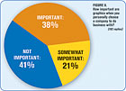
FIGURE 9. How important are graphics when you personally choose a company to do business with? (192 replies)
DO GRAPHICS REALLY AFFECT THE BUYING DECISION?
Respondents were asked if graphics really played a role in choosing who they would do business with. The question was “How important are graphics when you personally choose a company to do business with?” The responses, in Figure 9, showed that 41 percent said graphics were not important, 38 percent said graphics were important, and 21 percent felt that graphics were “somewhat” important.“Consumers are doing more research today than in years gone by,” said Gary Richardson of Rare Service Heating & Air Conditioning, Inc., Clovis, Calif. “They have more specific questions, and they respond in greater numbers to graphics that indicate a contractor is technically up-to-date and graphics is a great way to promote that technology.”
“Graphics can create a memorable event. “No one has said, ‘I called Marina because I saw your van.’ They have said ‘I know you, I see Marina vans all over town.’” said Jim Hussey of Marina Mechanical, San Leandro, Calif.
One contractor felt that the more information on the van, the less likely a customer is to go to another source to find information - a source where a lot of competitors “congregate.”
“Contact numbers are easy to remember,” said Jeff Fugere of Southern Climate Control, Tampa, Fla. “But customers may not look up the phone number and may be distracted by competitors’ ads when using the Yellow Pages.”
Another contractor summed up what most of the survey respondents felt. “It is a loud world,” said Matt Bergstrom of Thornton & Grooms, Birmingham, Mich. “We are bombarded with thousands of messages a day. You need to stick out to get noticed. However, the graphics also need to match the image you are trying to project.”
Sidebar: The Horse's Mouth
One respondent toThe NEWS’online survey about van graphics suggested that the survey was aimed at the wrong audience and a better survey - at least one that would be helpful to HVACR contractors - should be aimed at consumers.“These questions should be asked to the buying public so that contractors would have an idea if the extra cost of graphics pays off,” said Keith Nickas of Crown Heating & Cooling, Uniontown, Ohio.
“This survey won’t provide contractors with any concrete answers. It will only give results showing that the group of contractors paying extra for graphics believes it works and the group that doesn’t pay extra doesn’t know if it’s worth the investment. Give us a study that shows us what the buying public thinks so we can make an educated decision.”
Stay tuned for results from consumer surveys.
Publication date:06/23/2008


