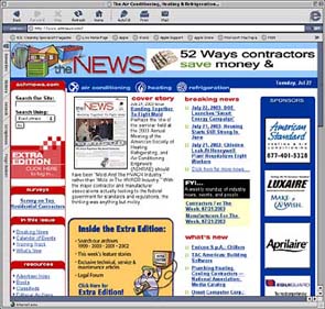
Which one is yours?
The best Web sites are designed — usually with the help of a design artist or someone who has Web design experience — to present a pleasing image, and are layed out logically to supply information in a user friendly way.
The point of any contractor site is to communicate and impart the essentials about your company. A good site is bright and lively, and embellishes each page with words and photos to demonstrate and illustrate that you are a solid business offering experience, expertise, and comfort solutions. It tells prospects who you are, what you do, how well you do it, what your service area is, and how to get in touch with you. It reminds your current customers of the complete range of products and services that you provide.
A weak Web site, on the other hand, is murky or unfocused or displays needless, easily correctable mistakes. You may think that some of these mistakes are small and people will overlook them. However, a prospect will notice and pick up on the smallest bits of information, and you will make an impression with your Web presentation.
Make sure you make a good impression.
The following are some Web mistakes that are still made to this day. These are the elements that should be avoided.
Cluttered, Disorganized Design
The best designs are simple and straightforward. They are organized. They use white space well. They give you the whole story but don’t try to jam too much on the page.The worst sites try to throw everything at you at once. They are cluttered and jumbled. There is no sense of organization.
If you haven’t studied design yourself, hire a designer to help you put together a new or redesigned Web site. The difference between a professionally designed Web site and a do-it-yourself site is usually very apparent. Look like a pro.
Extensive Use Of White Type On A Black Background
Putting large amounts of white type on a black background is harder to read than traditional black type on a white background. A number of studies have shown this to be true. This is especially true if the type is small.You can use white type on a black or other dark-colored background for headings or for small copy blocks for emphasis. It should not be used for large blocks of copy.
Don’t make it harder for prospects to read your message. The traditional approach still works best.
Overuse Of All Capital Letters
The use of sentence after sentence in all capital letters is likewise hard to read. Using upper and lower case puts some definition within and between the words and enhances readability. If you want to use all capital letters to emphasize a point, use it sparingly.The same applies to bold type and italics. Use them periodically to emphasize. But don’t use either for an entire paragraph.
Multi-Colored Type And Multiple Fonts
Some sites want to be colorful and they go overboard. They change the color of the type from one paragraph to the next. They may change the color within a paragraph. They change fonts, sometimes in the middle of a paragraph.All of these things can be distracting to a reader. Instead of being colorful, you’ll be annoying to your Web visitor.
Using multi-colored type and multiple fonts on a black background with lots of sentences in all capital letters compounds the error.
Spelling Errors
Don’t put spelling mistakes up on your Web site for all the world to see.When you write the copy for your Web site, use your spell checker. Every word processor has a spell checker and it only takes seconds to run through your text. Then read the copy over to catch any transpositions you may have made that are real words (like form instead of from).
You may think misspelling is a minor mistake. But if you’re willing to put up with minor mistakes on your Web site, the customer may believe you’ll be willing to put up with minor mistakes on the job.
Do it right the first time and don’t allow any mistakes on your site.
Grammatical Errors
Good grammar is not a thing of the past. Prospects will notice grammatical errors, especially if they read them over and over.Don’t use fractured language. Avoid slang.
Again, the point of a Web site is to communicate, clearly if not concisely. Be a good communicator.
Tiny, Postage-Stamp-Size Photos
I just recently looked at a site that has three tiny photos across the top. The photos look like they might be interesting. I cannot tell from what I can see.Put up photos that allow people to see what’s in them. They should not be overly large photos. But, to be effective, they do need to be big enough to show what’s there.
If you made the photo small because it’s not a very good photo, then don’t bother putting it on your Web site at all. It’s a waste of your time and a waste of the prospect’s time. Take a new photo and use that instead.
Excessive Use of Whiz-Bang Effects
Don’t have your home page start with a long, slow animation that the Web visitor is not able to skip. Include a skip button. After the first time, no visitor will likely want to see the animated introduction again. They may not want to see it the first time. Give them the opportunity to opt out and get right to the information they are seeking.Technical effects should be used in moderation, if you need them at all. The goal is not to impress people with spinning, blinking, or whirring special effects. The goal is to provide valuable information that aids in your HVACR marketing efforts.
Greg Mazurkiewicz is web editor. He can be reached at 248-244-6459; 248-362-0317 (fax); gregmazurkiewicz@achrnews.com.
Publication date: 07/28/2003


